With Week 9, I would like to discuss paradigms again.
In 2012, I created a developmental lag solution to the age crime curve puzzle that seemed to do a pretty good job of explaining why the age crime curve occurs. The solution was developed after I made a series of breakthroughs during several years of intense effort. Excited, I spent about a year writing a book on the solution I created. I called this book “The Criminological Puzzle.” Click the link below for a free copy.
The Criminological Puzzle Book
I sent “The Criminological Puzzle” to 250 developmental criminologists and no one got back to me with any feedback. I have since asked several people to look at it and I have not received any substantive feedback on the major points of my theory. The few comments I was able to get have ranged from “I’m too busy to look at this right now,” “You should focus on citing existing material in the criminological literature,” and “You should not write about the difficulty of understanding this material.”
If I describe the general points of my age crime curve theory to ordinary people, I get a general agreement that my ideas make sense. However, when I try to explain the mathematical details, I get glassy eyed stares and a lack of interest.
Where am I going wrong? This all makes perfect sense to me. It seems important. I used parts of this theory to build a health risk model that was 50% more accurate. The ideas seem sound.
To be honest, I had given up on trying to explain this to anyone, and was going to work on it when I retire in 5 years. The solution appears to require several paradigm shifts and to expect someone to follow all of these shifts at once seemed unrealistic. I had come to the conclusion that I need to publish a series of papers or a better version of my book if I am to provide some stepping stones to the solution that people might be able to follow.
There are multiple challenges. The math is hard. My solution uses a form of probability calculus that is generally not taught in school. Then, once you get past the math, the theory is based on human development over the life course, which very few people seem to understand and fewer people are collecting data on. Finally, my theory makes little logical sense because the solution to the age crime curve has very little to do with the causes of crime. This is a macro theory that does not fit with any prevailing scientific models. It seems to be a whole new way to think about things.
My position on waiting to work on this after I am 70 and retired has started to change recently. A few months ago, I met some people on LinkedIn who encouraged me to pursue my goal of trying to explain this. Their encouragement, plus the fact that there are some data scientists on LinkedIn who understand some of the probability calculus I am using, is the reason I started the 52 weeks of data pattern analysis blog posts.
Here are the eight 52 Weeks blog posts I created so far.
Week 4: What is Your Epistemology of Change?
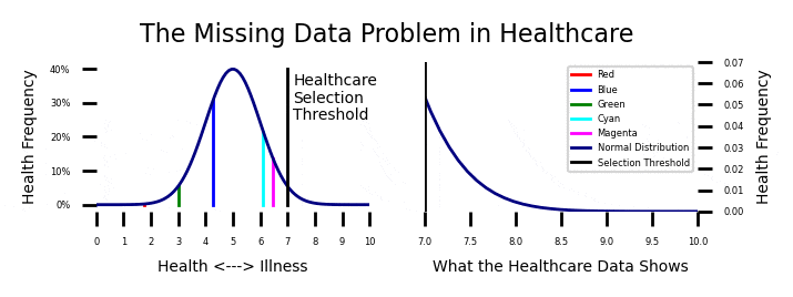
Week 5: The Healthcare Dilemma
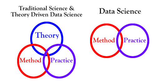
Week 6: Theory Driven Data Science
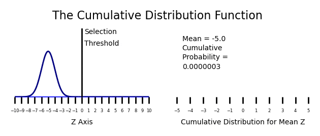
Week 7: Cumulative Distribution Functions
Week 8: The Male Age Crime Curve
Thanks again for all of the wonderful feedback I have received so far.
My Age Crime Curve Solution
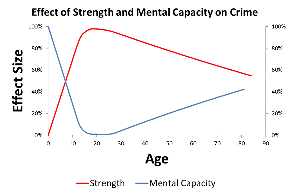
When Quetelet first started looking at the age crime curve in 1831, he proposed that the reasons for the age crime curve were obvious. He suggested that strength and passion developed before wisdom. Because people developed high levels of strength and passion before wisdom was fully developed, crime was rising rapidly in youth and young adulthood. After wisdom started to grow in young adulthood, crime started to decline until the really wise older people committed almost no crimes.
Quetelet’s theory is essentially a developmental lag theory, and my theory is similar. I have eliminated passion from the model and just focus on the trajectory of strength and mental capacity over the life course. I have been able to put the math related to normal cumulative distribution functions into the model, which makes everything work out.
My solution to the age crime curve involves looking at the trajectories of strength and mental capacity over the life course. There appears to be a 5 year lag between the development of peak strength (at about age 25) and the development of peak intelligence (at about age 30). My theory is that this developmental lag causes the age crime curve. It is the intersection of these two curves that causes the reversal of the crime trend at age 18.
The basic premise of my theory is that mental capacity reduces the chance of crime and strength increases the capacity for crime. The idea that increases in intelligence are causing a drop in criminal tendency from a young age appears to fit the data provided by Tremblay on the development of aggression over the life course. Apparently two year old children are the most aggressive humans, hitting, biting, screaming, etc., but they are too weak to do much damage.
His fascinating work can be found here.
Tremblay on Aggression Over the Life Course
My theory is that, even though aggression is declining from a young age, 18 year old people are committing more crimes because they are getting stronger and can do more damage.
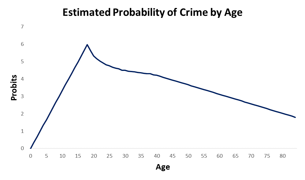
The effects of strength and mental capacity on the propensity for crime over the life course are plotted in the image at the top of the page. In order to accurately visualize what is happening to these two trajectories, we have to flip the effects of mental capacity upside down. When I add the combined effects of strength and mental capacity together over the life course, I get the projected age propensity curve shown below. This is simple straight forward addition of the two curves.
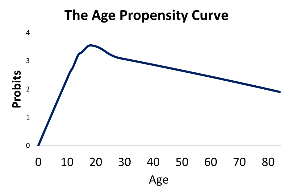
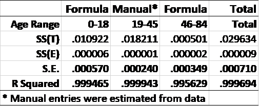
Recall from week 8 that the age crime curve is related to the age propensity curve through a normal transformation from a percentage to a Z Score. This model give a 99.995% R Squared over the first and last parts of the age crime curve.
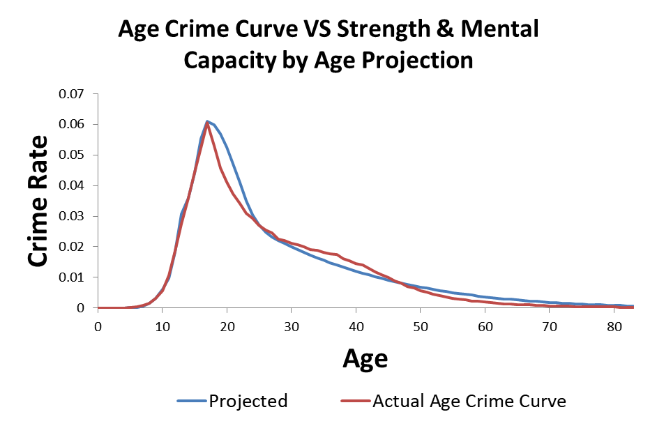
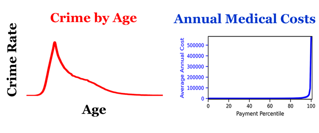
I modeled criminal propensity using a Z score transformation from percents to Z scores using the Probit (Z + 5). Crime is measured as the percentage of the population at each age that is participating in crime. If we use an inverse normal transformation to transform the criminal propensity Z scores (Probits) from the previous plot to crime percentages, we get the projected estimate of the age crime curve shown below.
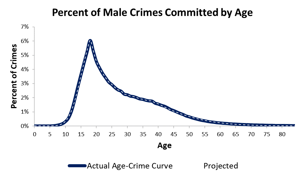
This particular version is not as accurate as it could be, but you get the idea. The model predicts the age crime curve with a high degree of accuracy. The model provides a “proof of concept” that the developmental curves for strength and mental capacity can be added together to produce a criminal propensity by age curve. The criminal propensity by age curve then can be transformed to a cumulative trajectory that reflects the age crime curve.
Confused? Perhaps my problem with explaining this becomes a little clearer.
Paradigms
Does any of this make sense? What does not? I can only guess at where I am losing people. Your input is welcome.
I’m looking at the paradigms I had to overcome in my own mind to develop this solution, and it seems like there are a whole bunch of them. These include the following.
- The age crime curve should be related to the causes of crime.
- You should use real data to do scientific research.
- Statistical models should focus on observable data.
I had to replace these paradigms in order to build the model I developed.
- The age crime curve is not directly related to the causes of crime.
- I can create my own data.
- The models have to use the data we can see to figure out what is happening with the data we can’t see.
I will stop here. I would appreciate any input from readers. Which paradigms would you need to change for this to make sense?


Recent Comments